Have you ever found yourself effortlessly navigating a website or app, almost as if it was reading your mind?
That’s not just good design—it’s psychology at work. The best UI/UX designs don’t just look good; they intuitively guide users by tapping into how we think, perceive, and interact with the world around us.
In this post, we’ll explore how understanding the user’s thought process can turn a good interface into a great one, creating experiences that are not only functional but also deeply satisfying.
Understanding the user’s thought process
Perception in UI design
Before diving into how psychological principles can be applied in product design, it’s important to understand the concept of perception. Perception refers to how users interpret information through their senses, including vision, hearing, touch, and proprioception (the sense of body position and movement).
While it may seem that not all of these senses are relevant to interface design, consider the innovations like Apple’s Vision Pro and its advancements in spatial computing – these show just how integral a multi-sensory experience can be.
IxD model
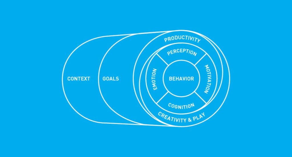
Perception is only a small cog in a much larger machine that is the Interaction Design (IxD) model. The IxD model is a key framework in UI/UX design, focusing on creating intuitive and effective interactions between users and products.
This model is built on several core components: context, which defines the circumstances in which the user interacts with a product, and goals, which outline what the user is trying to achieve. Nested within these are deeper intrinsic elements: motivation, which drives and directs the user’s behaviour, cognition and memory, which determine how effectively the user can store, recall, and recognise information; and emotion, which describes the level of pleasure or discomfort the user receives from using the product.
Delving deeper into cognition and memory, a designer’s primary responsibility is to create products that are easy to navigate, with information that can be easily accessed and retrieved when needed.
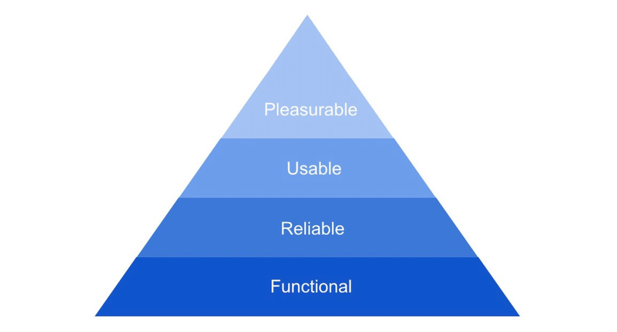
For products that are new or uniquely different, the design should facilitate a quick understanding of their functionality. The key objective should always be to reduce the user’s cognitive load by displaying only the necessary information at any given moment. This approach not only aids usability but also helps in delivering a pleasurable experience—an element that Aarron Walter, author of “Designing for Emotion”, highlights as the pinnacle of his hierarchy of product quality.
Industry methods to drive engagement
User research and testing
Moving from theory to practice, how can these psychological frameworks be applied in real-world scenarios? One of the most effective methods is through user research and testing, which allows product teams to observe and measure user behaviour directly.
It’s the responsibility of the product team to assess whether the designs are functioning as intended and to iterate on alternatives if they’re not. To achieve this, a variety of widely used tools are available, such as:
- Hotjar
- Maze
- Fullstory
- Crazyegg
- Lookback.
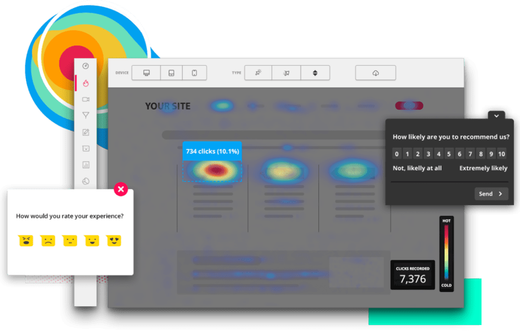
These tools provide valuable visual insights into user behaviour through heatmaps, session recordings, and surveys. They reveal not only what users are doing, but also how they’re doing it. Additionally, they are instrumental in uncovering bugs and usability issues, as they allow teams to watch real-world user interactions, identifying specific moments where users might rage click or encounter difficulties in the user flow.
Visual feedback
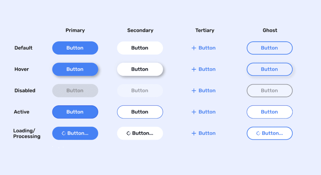
Visual feedback is a way for a UI to communicate with users, and is a fundamental aspect of UX design. It can help improve usability, engagement, and satisfaction by confirming actions, showing progress, indicating errors, or providing guidance. An example being the various states of a button component.
The interaction is first acknowledged with the button changing to a hover or pressed state, followed by a progress indicator showing that a result is in progress and completed with a processed state which confirms the completion of the interaction. Ultimately, effective visual feedback reassures users that their actions have been recognised and understood, creating a sense of control and confidence in the interface.
Ambient feedback
Another noteworthy form of feedback is ambient feedback, which provides real-time visual data to the user. This type of feedback allows users to receive instant updates on their actions or status, creating a continuous loop of interaction.
For example, fitness watches utilise ambient feedback by tracking metrics like pace and heart rate in real-time, feeding this data back to the user instantly. This immediacy not only keeps users informed but also gives the user a sense of interconnection with the device. Successful SaaS companies will also have interfaces that implement ambient feedback, providing real time data sheets and visualisation tools to allow the user maximum insight into the data.
Design patterns
Design patterns are standardised solutions to common design problems that users encounter while interacting with digital products. These patterns are essentially best practices that have been tested and refined over time, providing designers with a reliable framework to solve recurring challenges in a user-centred way.
By employing design patterns, designers can ensure consistency, usability, and familiarity across different parts of a product. The importance of design patterns lies in their ability to create intuitive and predictable interactions. When users encounter a familiar pattern, they can navigate the interface more easily and with greater confidence, reducing the cognitive load and the time needed to learn how to use the product.
A good example of a design pattern is the hamburger menu commonly used in mobile applications. This three-line icon expands to reveal a hidden navigation menu when tapped.
The hamburger menu is widely recognised by users, providing a consistent and space-efficient way to navigate apps with complex or extensive menus. Its familiarity and simplicity make it a go-to solution in mobile design, demonstrating how a well-established design pattern can streamline user interactions.
Affordances in design
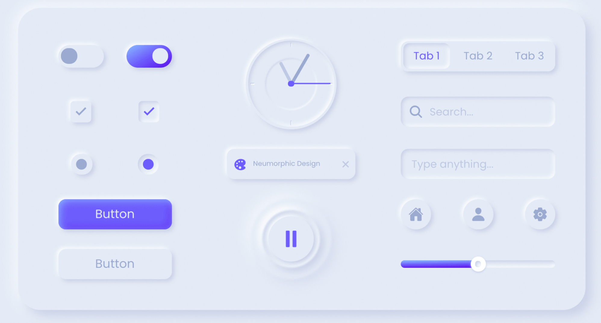
Next, let’s consider the concept of affordances in design. Affordances refer to the signals, cues, and indicators within a product that guide users toward possible interactions. These elements tap into our intrinsic understanding of the world, meaning they often don’t require conscious thought to be effective.
This makes affordances a powerful tool for prompting users to interact naturally with a product. A related concept is perceived affordances, which are digital elements designed to resemble real-world objects that users instinctively know how to interact with – like buttons that appear pressable, just as they would in the physical world.
Important UI/UX considerations
Avoiding dark patterns in UX
Having covered the psychological fundamentals and explored widely used methods to drive interaction and engagement, it’s crucial to consider the ethical responsibilities involved in designing digital products for public use.
The term ‘dark patterns’ refers to a range of unethical design practices that should be avoided. These are tactics intentionally crafted to mislead users into making choices or performing actions they might not have otherwise taken. Some examples of dark patterns include:
- Fake urgency
- Forced action
- ‘Nagging’ / repetitive
- Disguised ads
- Fake social proof
- Hidden costs
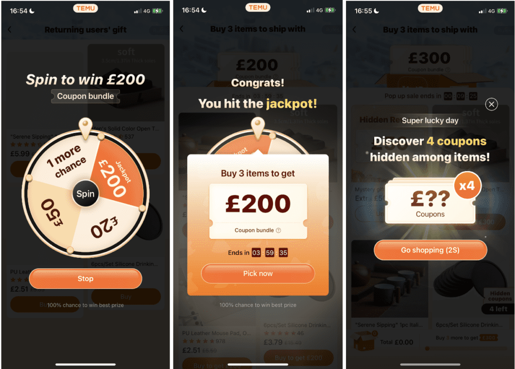
Even the largest brands are guilty of using dark patterns in their products. Take Temu, for example – a leading e-commerce company that employs questionable tactics. These include fake urgency, where unnecessary deadlines are set to pressure users into completing purchases, and repetitive pop-ups that not only mislead but also trap users, preventing easy access to the homepage when they first enter the app.
Using psychology to inform UI/UX design
In the world of UI/UX design, understanding psychology isn’t just a nice-to-have—it’s essential. From leveraging perception and cognition to applying tried-and-true design patterns and ethical considerations, these psychological principles help create products that are not only functional but genuinely enjoyable to use.
As designers, our goal should always be to craft experiences that are intuitive, engaging, and, above all, user-friendly. Remember, good design is about making life easier for the user, not harder. So, let’s design with empathy, keep things simple, and always put the user first.
As we’ve explored, the key to exceptional UI/UX design lies in understanding and empathising with the user. But knowing is just the first step—implementing these insights effectively can make all the difference.


